


FEATURED IN TELL YOUR STORY WALKING MAGAZINE 2024
PERSONAL VALUES POSTER SERIES
As a passion project over the summer, I wanted to create a series of posters for my first college apartment to make it feel more like home. When reflecting on the things that make a home, I considered some of the values I hold dear:
Travel, Movement, Solitude, Adventure, Creativity, Exploration, Laughter, Connection. I created 10 posters using photos from my own life, both of me and taken by me, created each letter by hand in Illustrator and experimented with overlays for the first time in Photoshop to create a series of posters to remind me of the things I hold dear. They now sit framed above my bed.
GRAPHIS NEW TALENT HONORABLE MENTION 2025
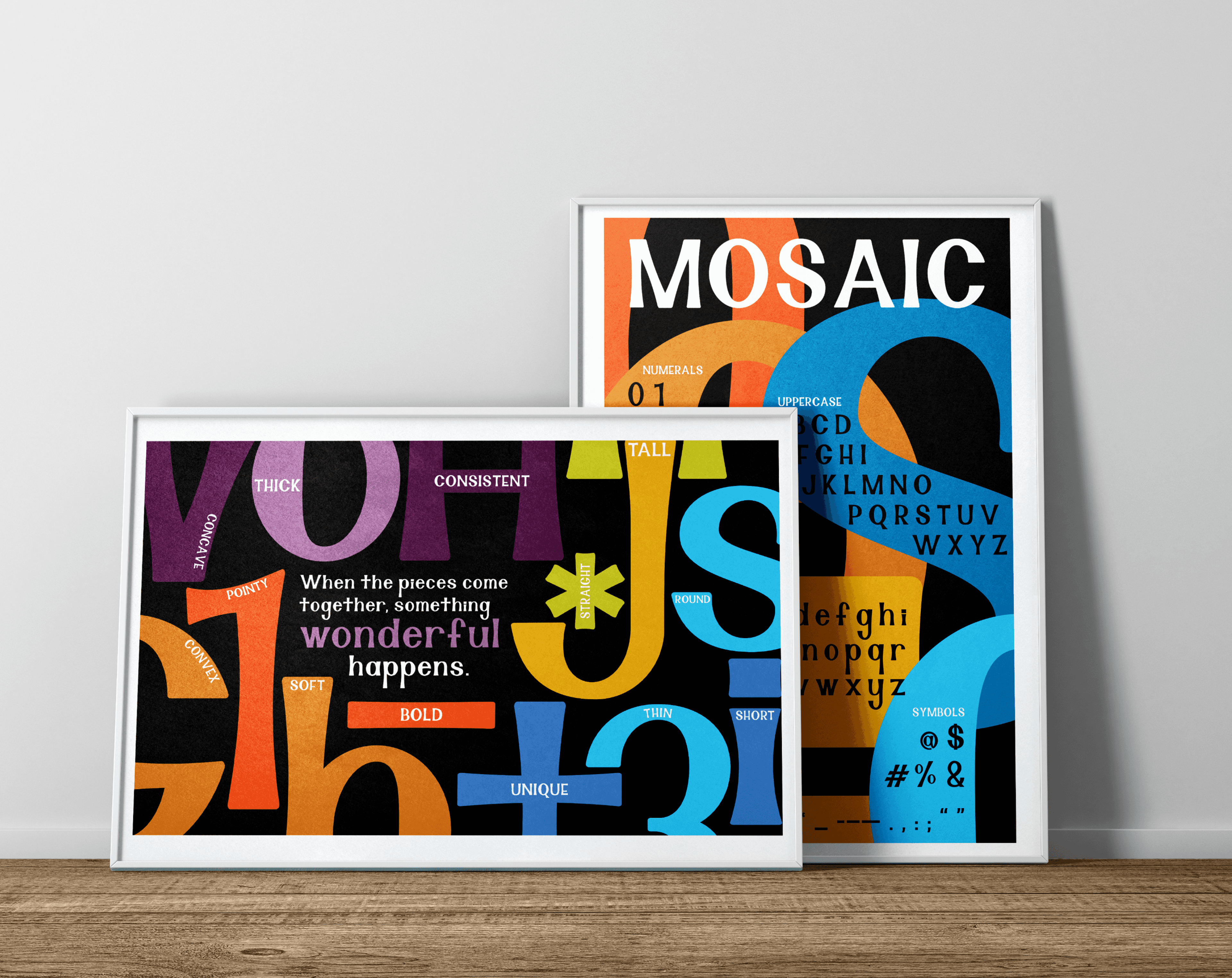
MOSAIC: CUSTOM TYPEFACE
Inspired by Professor Jordan Kligerman at Syracuse University, I hand-designed this typeface in GlyphsMini with balance and variation in mind. I wanted it to be a combination of every opposing trait that makes Professor Kligerman so unique. With a balance of short and tall letters, thick and thin strokes, convex and concave curves, pointy and round edges, each letter is a piece in the “mosaic” that is Mosaic.
GRAPHIS NEW TALENT HONORABLE MENTION 2025
BLACK ARTISTS STAMP SERIES
This series is an homage to Black contributions in the music industry, highlighting just a few of the many Black artists who have shaped and inspired their respective genres. I chose to represent them through their iconic hairstyles combined with classic instruments of their genres. I am most proud of my Gestalt representation of Jimi Hendrix’s head as the body of his electric guitar.
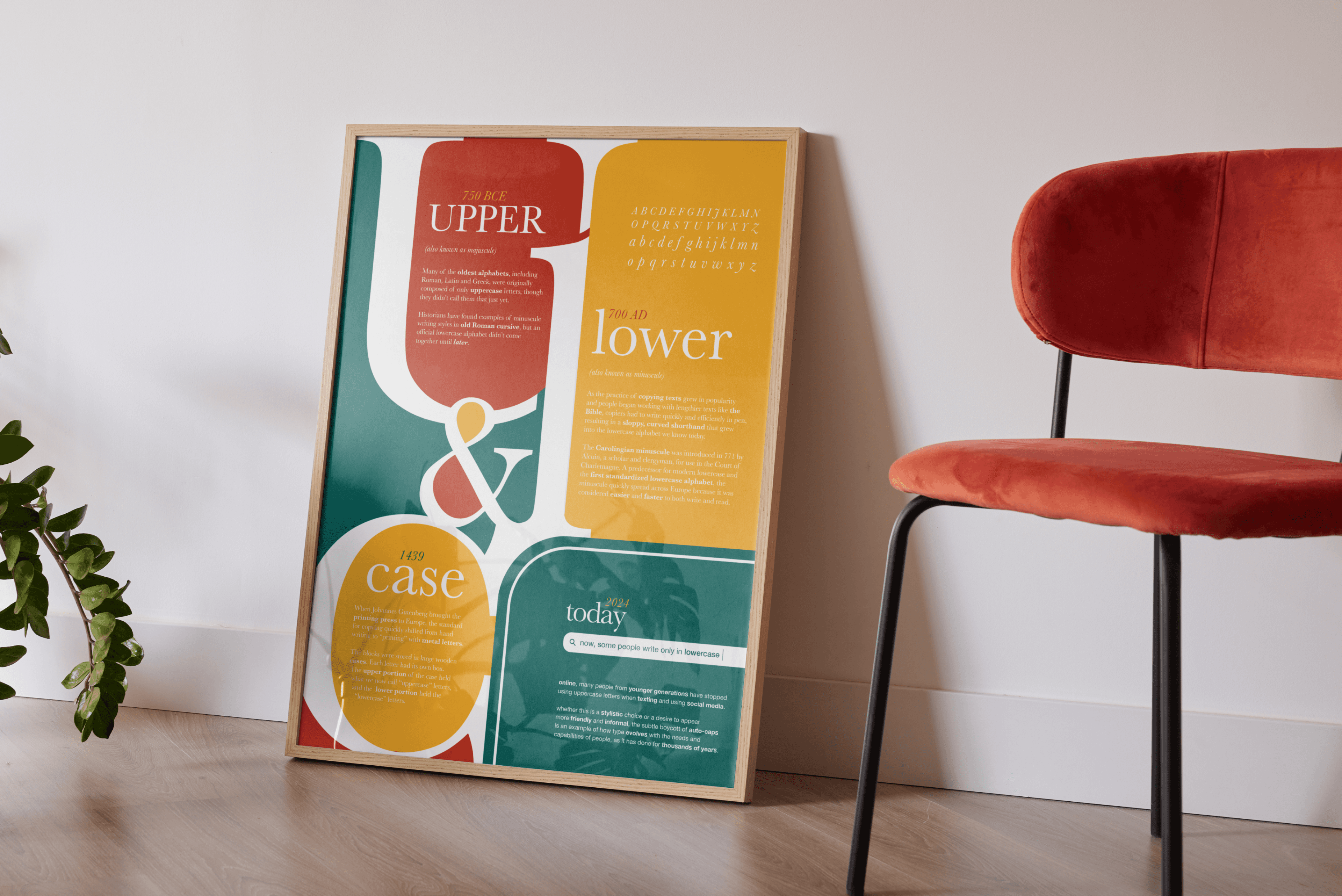
HISTORY OF UPPERCASE AND
LOWERCASE LETTERS
I created this poster to highlight the fascinating history of lower case letters and their upper case origins. To emphasize this transition and the lasting similarities between the two cases, I wanted the letters to blend into each other. I used a transitional serif for the large letters to further this derivative idea, as well as a sans-serif for the “today” section to highlight its modern usage. Similarly, the colors are hues of the three primary colors, continuing the theme of transition.
ADVERTISING FOR INSTACART
This assignment was an exercise in following brand guidelines and mimicking styles of existing brands. I chose InstaCart because of its fun illustration style and broad color palette. InstaCart is also well known for its photography style, so I did my best to find stock photos that emulate the brand. With the copywriting, I went with a more casual and playful tone to further imitate their advertisement strategy.
HER FIGHT, HIS NAME: THE STORY OF GWEN CARR AND ERIC GARNER
Working with producers Brad Bailey and Jered Everson,
I designed this poster for their documentary short film, “Her Fight His Name: The Story of Gwen Carr and Eric Garner.”
I was inspired by the passion and fight of the mothers who had lost children to police violence, led in part by Gwen Carr, the star of the film. I chose to illustrate her in red, her signature color and a symbol of passion, anger and blood. The mothers standing behind her are diverse in appearance but they share the same expression, symbolizing their shared fight for justice.
My poster was one of three in my class used to promote the movie and I was later tasked with designing one specifically for OSCARS consideration, in addition to a billboard.
miscellaneous


GRAPHIS NEW TALENT HONORABLE MENTION 2025
MOSAIC: CUSTOM TYPEFACE
Inspired by Professor Jordan Kligerman at Syracuse University, I hand-designed this typeface in GlyphsMini with balance and variation in mind. I wanted it to be a combination of every opposing trait that makes Professor Kligerman so unique. With a balance of short and tall letters, thick and thin strokes, convex and concave curves, pointy and round edges, each letter is a piece in the “mosaic” that is Mosaic.
GRAPHIS NEW TALENT HONORABLE MENTION 2025
BLACK ARTISTS STAMP SERIES
This series is an homage to Black contributions in the music industry, highlighting just a few of the many Black artists who have shaped and inspired their respective genres. I chose to represent them through their iconic hairstyles combined with classic instruments of their genres. I am most proud of my Gestalt representation of Jimi Hendrix’s head as the body of his electric guitar.
FEATURED IN TELL YOUR STORY WALKING MAGAZINE 2024
PERSONAL VALUES POSTER SERIES
As a passion project over the summer, I wanted to create a series of posters for my first college apartment to make it feel more like home. When reflecting on the things that make a home, I considered some of the values I hold dear:
Travel, Movement, Solitude, Adventure, Creativity, Exploration, Laughter, Connection. I created 10 posters using photos from my own life, both of me and taken by me, created each letter by hand in Illustrator and experimented with overlays for the first time in Photoshop to create a series of posters to remind me of the things I hold dear. They now sit framed above my bed.
HER FIGHT, HIS NAME: THE STORY OF GWEN CARR AND ERIC GARNER
Working with producers Brad Bailey and Jered Everson,
I designed this poster for their documentary short film, “Her Fight His Name: The Story of Gwen Carr and Eric Garner.”
I was inspired by the passion and fight of the mothers who had lost children to police violence, led in part by Gwen Carr, the star of the film. I chose to illustrate her in red, her signature color and a symbol of passion, anger and blood. The mothers standing behind her are diverse in appearance but they share the same expression, symbolizing their shared fight for justice.
My poster was one of three in my class used to promote the movie and I was later tasked with designing one specifically for OSCARS consideration, in addition to a billboard.
HISTORY OF UPPERCASE AND
LOWERCASE LETTERS
I created this poster to highlight the fascinating history of lower case letters and their upper case origins. To emphasize this transition and the lasting similarities between the two cases, I wanted the letters to blend into each other. I used a transitional serif for the large letters to further this derivative idea, as well as a sans-serif for the “today” section to highlight its modern usage. Similarly, the colors are hues of the three primary colors, continuing the theme of transition.
ADVERTISING FOR INSTACART
This assignment was an exercise in following brand guidelines and mimicking styles of existing brands. I chose InstaCart because of its fun illustration style and broad color palette. InstaCart is also well known for its photography style, so I did my best to find stock photos that emulate the brand. With the copywriting, I went with a more casual and playful tone to further imitate their advertisement strategy.
my other work